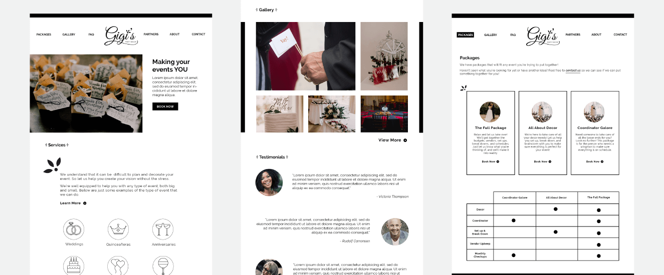
Gigi's Party Decor
Gigi's Party Decor
2019
Brand Identity
About
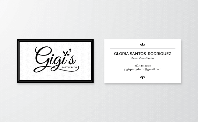
The owner of Gigi's Party Decor, Gloria Santos-Rodriguez, needed a logo and business card that would reflect the personality of her business: playful and sophisticated. She wanted Since the event coordinating industry is quite saturated, I wanted Gigi's Party Decor to stand out with a strong prescence that doesn't diminish the playfulness of the brand. I wanted her to have a brand that is bold and eyecatching that contrasts with the round and fun fonts and elements.
Thinking it Over
When I hear the word "fun," I immediately jump to sparkles, balloons and in-your-face colors that you'll never forget. Which, of course, doesn't quite fit in Gigi's Party Décor all the way. Gigi's Party Décor caters to the sophistication of the event; the fun is weaved in-between.
The challenge of creating a logo for Gigi's Party Décor is to stand out from her competitors and to appeal to her wide audience. Since the owner, Gloria Santos-Rodriguez, wants her business to be a part of various party types, it was difficult trying to pin down a certain style.



Fun (but not too fun)
I traded in my sparkles for a flower that would act as a pattern and a marker for things that need to create attention. To stand out from the crowd but still have a bold presence, Gigi's Party Decor's main colors are black and white with a grayscale as secondary colors.
The company's typefaces mix a readable serif and sans-serif to create a refined-chic feel.
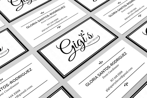
Gigi's Party Décor's brand has an elegant and playful nature that's paired with bold and sharp outlines.
